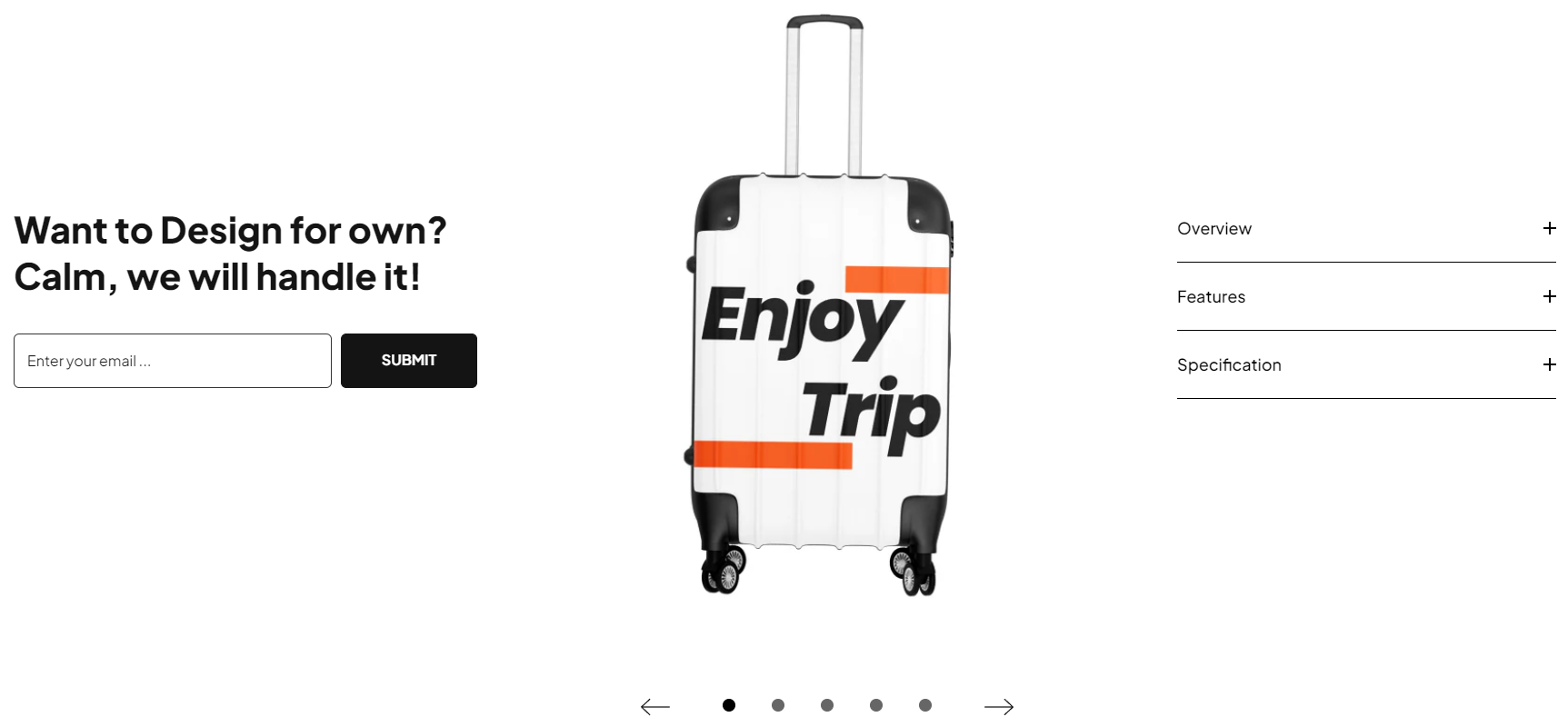

| Settings | Meaning | |
|---|---|---|
| Section width | Select the layout width of the whole section. The options are: Default (same as the body width) Width (1170px) Width (1770px) Full width (100% of the viewport width). | |
| Padding for 'full width' option on desktop | Determine the left and right spacing of the full width layout. | |
| Background color | Set color for the section background. | |
| Background gradient | Set color gradient for the section background. | |
| Background image | Upload an image as the section background. |
| Settings | Meaning | |
|---|---|---|
| Title | Enter the title text for section. | |
| Title font size | Determine the font size of the title on tablet and desktop | |
| Title font size on mobile | Determine the font size of the title on mobile | |
| Title font weight | Select the font weight of the title to be either Normal, Medium, Semibold, Bold, Extra bold, or Black. | |
| Title style | Transform the text of the title to be either none, uppercase, lowercase, or capitalize. | |
| Title font style | Select the font style of the text. | |
| Title color | Apply a color to the title of the section. | |
| Title bottom margin | Determine the spacing of the title from bottom on tablet and desktop. | |
| Title bottom margin on mobile | Determine the spacing of the title from bottom on mobile. | |
| Input maximum width | Set the width of the input field between 300px and 800px. | |
| Input corner radius | Determine the roundness of the block item. | |
| Input font size | Determine the font size of the input field. | |
| Button label | Enter the text for the button label. | |
| Button font size | Determine the font size of the button. | |
| Button width | Set the width of the button between 100px and 300px. | |
| Button label color | Set the text color of the button. | |
| Button border color | Set the border color of the button. | |
| Button background color | Set the background color of the button. | |
| Button background gradient | Set the background gradient of the button. | |
| Button label hover color | Set the text color hover of the button. | |
| Button border hover color | Set the border color hover of the button. | |
| Button background hover color | Set the background hover of the button. | |
| Button background hover gradient | Set the background hover gradient of the button. | |
| Button label style | Transform the text of the button to be either none, uppercase, lowercase, or capitalize. | |
| Button font weight | Select the font weight of the button. | |
| Placeholder text | Enter in the placeholder text for the button field. | |
| Placeholder color | Set the placeholder text color of the button. | |
| Input background color | Set the input background color of the input field. | |
| Input border color | Set the input border color of the input field. | |
| Spacing between input and button | Set the spacing between input and button. |
| Settings | Meaning | |
|---|---|---|
| Heading color | Set the color of the collapsible heading | |
| Border color | Set the border bottom color of the collapsible heading. | |
| Icon color | Set the color of the open and close icons for the collapsible heading. |
| Settings | Meaning |
|---|---|
| Desktop | Determines the height of the top inner space of the section on the desktop device. Can be from 0px to 200px, increasing arithmetically of 5px (pixel). |
| Tablet | Determines the height of the top inner space of the section on the tablet device. Can be from 0px to 100px, increasing arithmetically of 5px (pixel). |
| Mobile | Determines the height of the top inner space of the section on the mobile device. Can be from 0px to 100px, increasing arithmetically of 5px (pixel). |
| Settings | Meaning |
|---|---|
| Desktop | Determines the height of the bottom inner space of the section on the desktop device. Can be from 0px to 200px, increasing arithmetically of 5px (pixel). |
| Tablet | Determines the height of the bottom inner space of the section on the tablet device. Can be from 0px to 100px, increasing arithmetically of 5px (pixel). |
| Mobile | Determines the height of the bottom inner space of the section on the mobile device. Can be from 0px to 100px, increasing arithmetically of 5px (pixel). |
| Settings | Meaning | |
|---|---|---|
| Image | Upload an image to set it as the banner. | |
| Button link | Enter link for the button to redirect to. |
| Settings | Meaning | |
|---|---|---|
| Heading | Enter the heading for the collapsible heading. | |
| Content | Enter the text for the collapsible content. | |
| Content from page | Select the page and get the content from it. |