
| Settings | Meaning |
|---|---|
| Section width | Select the layout width of the whole section. The options are: Default (same as the body width) Width (1170px) Width (1770px) Full width (100% of the viewport width). Note: To fit more videos in a row, a wider layout is more appropriate. |
| Padding for 'full width' option on desktop | Determine the custom left & right spacing for full width layout. |
| Background color | Apply the color to the background of the section. |
| Background gradient | Apply the gradient to the background of the section. Background gradient will replace Background Color if any. |
| Settings | Meaning |
|---|---|
| Alignment | Select the position of the content to be either to the left, right or center of its container. |
| Subtitle | Enter the sub-heading for the section. |
| Subtitle font size | Determine the font size for the subtitle text. |
| Subtitle font size on mobile | Determine the font size for the subtitle text on mobile device. |
| Subtitle font weight | Select the font weight for the subtitle text. The options are: Normal, Medium, Semi Bold, Bold, Bolder, Black. |
| Subtitle color | Apply color onto the subtitle text. |
| Subtitle top margin | Determine the spacing of the subtitle from its bottom. |
| Subtitle font style | Select the font style of the subtitle text. The font styles are: Normal, Italic, Oblique. |
| Subtitle letter spacing | Enter the spacing between letters of the subtitle. Note: the recommended unit is em. |
| Title | Enter the title for the section. |
| Title font size | Determine the font size for the title text. |
| Title font size on mobile | Determine the font size for the title text on mobile device. |
| Title font weight | Select the font weight for the title text. The options are: Normal, Medium, Semi Bold, Bold, Extra Bold, Black. |
| Title color | Apply color onto the title text. |
| Title top margin | Determine the spacing of the title from its top. |
| Font style | Select the font style of the title text. The font styles are: Normal, Italic, Oblique. |
| Title letter spacing | Enter the spacing between letters of the title.
|
| Maximum title width | Determine the maximum width of the section title. |
| Description | Enter the description for the section. |
| Description font size | Determine the font size for the description text. |
| Description font size on mobile | Determine the font size for the description text on mobile device. |
| Description font weight | Select the font weight for the description text. The options are: Normal, Medium, Semi Bold, Bold, Extra bold, Black. |
| Description color | Apply color onto the description text. |
| Description top margin | Determine the spacing of the description from its top. |
| Maximum description width | Determine the maximum width of the section description. |
| Letter spacing | Enter the spacing between letters of the description. Note: the recommended unit is em. |
| Button type | Select the button type of the section. The types are: Button & Link. |
| Button link | Enter the link for the button to redirect to. |
| Button | Enter the text for the button. |
| Button font size | Determine the font size for the text of the button. |
| Button width | Determine the width of the button. |
| Button top margin | Determine the spacing of the button from its top. |
| Text color | The text color of the button. |
| Border color | The border color of the button. |
| Background color | The background color of the button. |
| Background gradient | The background gradient of the button. |
| Text hover color | The text color of the button for hover state. |
| Border hover color | The border color of the button for hover state. |
| Background hover color | The background color of the button for hover state. |
| Background hover gradient | The border gradient of the button for hover state. |
| Letter spacing | Enter the spacing between letters of the button text. Note: the recommended unit is em. |
| Show custom border | Toggle the custom border, which looks like an outer background for an echo effect on the button. |
| Border color | Apply a color for the custom border if turned on. |
| Button label style | Select the transform style for the button text. The options are: None, Capitalize, Uppercase, Lowercase. |
| Button font weight | Select the font weight for the button text. The options are: Normal, Medium, Semi Bold, Bold, Extra bold, Black. |
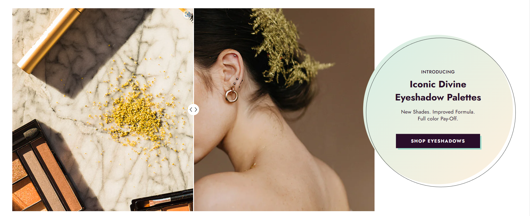
| Content position | Select the position of the content including title, subtitle, description, button to be either on top, to the left or to the right of the images comparison slider. |
| Content style | Select the style for the content. There are 2 styles: Style 1 Style 2 Note: Applies when the ‘left of compare images’ or ‘right of compare images’ option is selected. |
| Background | Apply the color for the background of the content style 2. |
| Background gradient | Apply the gradient for the background of the content style 2. |
| Border | Apply the color for the border of the content style 2. |
| Settings | Meaning |
|---|---|
| Desktop | Determines the height of the top inner space of the section on the desktop device. Can be from 0px to 100px, increasing arithmetically of 5px (pixel). |
| Tablet | Determines the height of the top inner space of the section on the tablet device. Can be from 0px to 100px, increasing arithmetically of 5px (pixel). |
| Mobile | Determines the height of the top inner space of the section on the mobile device. Can be from 0px to 100px, increasing arithmetically of 5px (pixel). |
| Settings | Meaning |
|---|---|
| Desktop | Determines the height of the bottom inner space of the section on the desktop device. Can be from 0px to 100px, increasing arithmetically of 5px (pixel). |
| Tablet | Determines the height of the bottom inner space of the section on the tablet device. Can be from 0px to 100px, increasing arithmetically of 5px (pixel). |
| Mobile | Determines the height of the bottom inner space of the section on the mobile device. Can be from 0px to 100px, increasing arithmetically of 5px (pixel). |