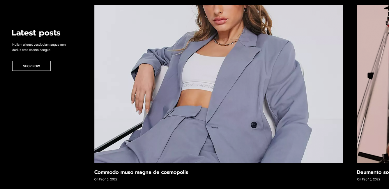

| Settings | Meaning | |
|---|---|---|
| Section width | Select the layout width of the whole section. The options are: Default (same as the body width) Width (1170px) Width (1770px) Full width (100% of the viewport width). | |
| Padding for 'full width' option on desktop | Determine the left and right spacing of the full width layout. | |
| Background color | The background color of the section. | |
| Background gradient | The background gradient of the section. | |
| Title | Enter in the title for the section. | |
| Title font size | Specify the font size of the title. | |
| Title font size on mobile | Specify the font size of the title on the mobile. | |
| Title bottom margin | Determine the spacing of the title from bottom. | |
| Title color | Apply a color to the title of the section. | |
| Description | Enter the text for the description. | |
| Description bottom margin | Determine the spacing of the description from the bottom. | |
| Description color | Apply a color to the description. | |
| Button label | Enter the text for the button. | |
| Button link | Enter URL for the button to redirect to. | |
| Button label color | The text color of the button. | |
| Button border color | The border color of the button. | |
| Button background color | The background color of the button. | |
| Button background gradient | The background gradient of the button. | |
| Button label hover color | The text color of the button for hover state. | |
| Button border hover color | The border color of the button for hover state. | |
| Button background hover color | The background color of the button for hover state. | |
| Button background hover gradient | The background gradient of the button for hover state. | |
| Button width | Set the width of the button. |
| Settings | Meaning | |
|---|---|---|
| Blog | Select Blog to show. | |
| Grid gap | Determines the gap between items. | |
| Number of blog posts to show | Limit the number of post to show. | |
| Blog posts description length | Limit the description word count to truncate. | |
| Title bottom margin | Determines the spacing of the title from bottom. | |
| Info bottom margin | Determines the spacing of the info from bottom. | |
| Description bottom margin | Determines the spacing of the description from bottom. | |
| Title color | Apply a color to the title blog of the item. | |
| Date color | Apply a color to the date blog of the item. | |
| Description color | Apply a color to the description blog of the item. | |
| Show description | Display the blog description. | |
| Show navigation arrows | Toggle to show arrows for slider. | |
| Show navigation dots | Toggle to show dots in slide. |
| Settings | Meaning |
|---|---|
| Desktop | Determines the height of the top inner space of the section on the desktop device. Can be from 0px to 100px, increasing arithmetically of 5px (pixel). |
| Tablet | Determines the height of the top inner space of the section on the tablet device. Can be from 0px to 100px, increasing arithmetically of 5px (pixel). |
| Mobile | Determines the height of the top inner space of the section on the mobile device. Can be from 0px to 100px, increasing arithmetically of 5px (pixel). |
| Settings | Meaning |
|---|---|
| Desktop | Determines the height of the bottom inner space of the section on the desktop device. Can be from 0px to 100px, increasing arithmetically of 5px (pixel). |
| Tablet | Determines the height of the bottom inner space of the section on the tablet device. Can be from 0px to 100px, increasing arithmetically of 5px (pixel). |
| Mobile | Determines the height of the bottom inner space of the section on the mobile device. Can be from 0px to 100px, increasing arithmetically of 5px (pixel). |