Ella Documentation
Open a Store for FREEExclusive OffersServicesResources
  • Greeting + Useful Resources
  • Exclusive Offers 🔥
  • Changelog
  • Full Theme Features in Ella 6
  • Installation
    • Install Theme 🎯
    • Update Theme 🔔
      • Update from Ella 1.0, 2.0, 3.0, 4.0, 5.0 to Ella 6.0
      • Update from Ella 6.0 to a higher version
      • Theme Update Service
    • Install App
  • Basic Configuration
    • Customer Registration
    • Shipping Rates
    • Navigation
    • Sticky Toolbar Mobile
    • Online Store 2.0
      • Color Gradient
      • Dynamic Source
  • Theme Settings
    • Multiple Layouts
    • Typography
    • General
      • Favicon
      • Wishlist
      • X-shaped cursor
      • Terms and conditions
      • Swatch
      • Variant picker
      • Customization option
      • Customer login
      • Hot stock function
      • Add to cart action
      • Lazy load image
      • Slider dots
      • Slider arrows
      • Pagination
      • Trusted image
      • Dynamic browser tab title
      • Saved price
      • Scroll down to the next section
      • View documentation
    • Product card
      • Change product card layout
      • Set up for product card
      • Positive vibes bundle
      • Product badges
      • Product Swatch
      • Product Action
      • Quick Shop
      • Marquee
    • Theme Language
      • How to set up a different language?
      • How to set up Multiple Languages?
    • Multiple Currencies
    • Multi-Level Categories
    • Quick Search
    • Quick Cart/ Quick Edit Cart
    • Quick View
    • Countdown
    • Free Shipping Calculator Message
    • Someone Purchased Notification Popup
    • GDPR Popup
    • Newsletter Popup
    • Recently Viewed Popup
    • Before You Leave
    • Notify Me When Out Of Stock
    • Ask An Expert
    • Social Media
    • Product Colors
    • General colors
    • Animations
    • Adding custom CSS to your theme
    • Custom JS
    • Checkout
  • Header
    • Header For Desktop
      • Home 01 - Classic
      • Home 02 - Trendy Style
      • Home 03 - In vogue
      • Home 04 - High Fashion
      • Home 05 - Surfing
      • Home 06 - SuperMarket
      • Home 07 - Electronics
      • Home 08 - Large Catalogs
      • Home 09 - Pet Supplies
      • Home 10 - Jewelry
      • Home 11 - Health & Beauty
      • Home 12 - Men Fashion
      • Home 13 - Winter Sport
      • Home 14 - Automotive 1
      • Home 15 - Automotive 2
      • Home 16 - Game
      • Home 17 - Gym
      • Home 18 - Shoes
      • Home 19 - Swimwear 1
      • Home 20 - Furniture
      • Home 21 - Yoga
      • Home 22 - Eyes Wears
      • Home 23 - Plant+ Garden
      • Home 24 - Bicycle
      • Home 25 - Swimwear 2
      • Home 26- Bagratica
      • Home 27 - Men Fashion 02
      • Home 28 - Single Product
      • Home 29 - Chic Couture
      • Home 30 - POD Store
      • Home 31 - Hair Wigs
      • Home 32 - Suitcase
      • Home 33 - Coffee Shop
      • Home 34 - Lunch Set
      • Home 35 - Dietary Supplement
    • Header For Mobile / Tablet
    • Set up Advanced Mega Menu/ Drop Down Menu
      • Label For Menu
    • Mobile Menu
  • FOOTER
    • Footer Layout
      • Home 01 - Classic
      • Home 02 - Trendy Style
      • Home 03 - In vogue
      • Home 04 - High Fashion
      • Home 05 - Surfing
      • Home 06 - SuperMarket
      • Home 07 - Electronics
      • Home 08 - Large Catalogs
      • Home 09 - Pet Supplies
      • Home 10 - Jewelry
      • Home 11 - Health & Beauty
      • Home 12 - Men Fashion
      • Home 13 - Winter Sport
      • Home 14 - Automotive 1
      • Home 15 - Automotive 2
      • Home 16 - Games
      • Home 17 - Gym
      • Home 18 - Shoes
      • Home 19 - Swimwear 1
      • Home 20 - Furniture
      • Home 21 - Yoga
      • Home 22 - Eyes Wears
      • Home 23 - Plant+ Garden
      • Home 24 - Bicycle
      • Home 25 - Swimwear 2
      • Home 26 - Bagratica
      • Home 27 - Men Fashion 02
      • Home 28 - Single Product
      • Home 29 - Chic Couture
      • Home 30 - POD Store
      • Home 31 - Hair Wigs
      • Home 32 - Suitcase
      • Home 33 - Coffee Shop
      • Home 34 - Lunch Set
      • Home 35 - Dietary Supplement
  • SECTIONS
    • Section On Every Page
    • All Sections in Theme
      • Announcement Bar
      • Multitab Image
      • Brand Slider
      • Brands Showcase
      • Banner Motion
      • Before/After Image Slider
      • Blog Posts
      • Blog Posts List
      • Blog Posts Slider
      • Custom Text
      • Custom Image Banner
      • Custom Liquid
      • Custom Press Banner
      • Customer testimonial
      • Customer Review
      • Custom Service Block
      • Custom Product Widget
      • Counter Positions Image Banner
      • Collapsible Content
      • Collection List
      • Featured Categories
      • Featured Product
      • FAQs
      • Google Map
      • Image Banner
      • Instagram
      • Instagram Visual Grid
      • Instagram Special
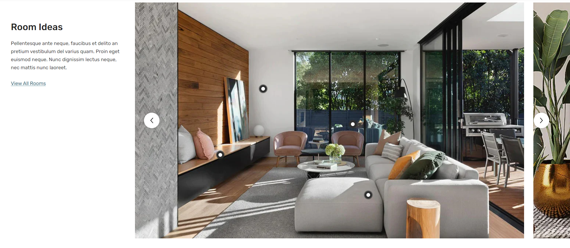
      • Highlights Lookbook
      • Newsletter
      • Newsletter with banners
      • Newsletter With Countdown
      • Marquee
      • Multilayer image
      • Page
      • Policies Block
      • Product Block
      • Product Block Duo
      • Product Tabs
      • Product Vertical
      • Product Highlight
      • Puzzled Image Banner
      • Rich Text
      • Slideshow
      • Search Block
      • Spotlight Block
      • Special Banner
      • Spotlight Products
      • Slidable Spotlight
      • Sticky Scrolling Banner
      • TikTok Video
      • Video
      • Visual Lookbook
    • Product Combo
  • Collections List Page
    • Demo & Settings Data
    • Collections List Section
  • Collections Page
    • Demo & Settings Data
    • Sub Collection
    • Collection section
      • Collection header
      • Main collection
        • Filter
  • Product Page
    • Demo & Settings Data
    • Product Information
      • Product Media
      • Product Tabs
      • Product Variant
      • Size Chart
      • Description
      • Delivery Time
      • Dynamic Checkout Button
      • Color Comparison
      • Sticky Add To Cart
      • Sold In Last Period
      • Customers Viewing
      • Custom Information
      • How To Set Up Product Description For Each Variant?
      • How To Set Up Product Property By Metafields?
      • How To Set Up Complementary Products?
      • Positive Vibes Bundle
      • Combined Products Listing
      • List Tags
    • Variant Image Grouped
    • Product Bundle
    • Product Combo
    • Quick Order List
    • Product Description Tab
    • Product Recommendations
    • Recently Viewed Products
    • How To Set up Pre-Order Product?
    • How To Set Up Local Pickup?
  • Blog
    • Blog
    • Default Layout
    • Layout 01
    • Layout 02
    • Layout 03
    • Layout 04
  • Article
    • Article
    • Default Layout
    • Layout 01
  • Page
    • How To Create A Page?
    • Find A Store/ Store Locator Page
    • Landing Page
      • Landing Page 01
      • Landing Page 02
      • Landing Page 03
    • Wishlist Page
    • Brands Page
    • Collection Detail Page/ Sub Collection Page
    • FAQs Page
      • Layout 01
    • Lookbook Page
      • Layout 01
    • Contact Us Page
      • Layout 01
      • Layout 02
    • About Us Page
      • Layout 01
      • Layout 02
    • Portfolio Page
      • Layout 01
      • Layout 02
    • Password Page
      • Layout 01
      • Layout 02
    • Other Pages
      • 404 Page
      • Search Page
  • Our Services
    • Theme Installation Service
    • Theme Update Service
    • Theme Development Service
    • Website UI Design
  • Knowledge Base
  • Theme Support
Powered by GitBook
On this page
  • Section settings
  • General
  • Lookbook image blocks
  • Show all button
  • Section top padding
  • Section bottom padding
  • Blocks settings
  • [BLOCK] Lookbook image
  1. SECTIONS
  2. All Sections in Theme

Highlights Lookbook

PreviousInstagram SpecialNextNewsletter

Last updated 6 months ago

To add this section, please follow below steps:

  1. From your Shopify admin, go to Online Store -> Themes.

  2. Find the theme that you want to edit, and then click Customize.

  3. Click Add section and choose "Highlights lookbook".

Section settings

General

Settings
Description

Section width

Select the layout width of the whole section. The options are: Default (same as the body width) Width (1170px) Width (1770px) Full width (100% of the viewport width).

Padding for 'full width' option on desktop

Determine the left and right padding of the section when the full width layout is selected.

Background color

The background color of the section.

Background gradient

The gradient background of the section.

Section header

Title

Enter text for the section title.

Title color

Set color for the section title.

Title bottom margin

Determine the bottom spacing of the title.

Title top margin

Determine the top spacing of the title.

Title font size

Specify the font size of the section title.

Title font size on mobile

Specify the font size of the section title on Mobile device.

Description

Enter text for the section description.

Description color

Set color for the section description text.

Description bottom margin

Determine the bottom spacing of the description text.

Description font size

Determine the font size of the description text.

Description font size on mobile

Determine the font size of the description text on Mobile.

Alignment

Select the alignment of the content including title, description to be either to the Left, Right or Center.

Content width

Set the width for the section content.

View all

Enter text for the view all link.

'View all' link

Set URL for the view all link to redirect to.

'View all' link color

Apply color for the view all text.

Show 'view all' border

Toggle to show border/underline of the view link

'View all' font size

Set the font size for the view all text.

'View all' font weight

Select the font weight of the view all to be either Normal, Medium, Semi Bold, Bold, Extra bold, or Black.

'View all' alignment

Select the position of the view all to be either to the Left, Right or Center.

Top margin of the view all button

Determine the top spacing of the view all link.

Lookbook image blocks

Settings
Description

Popup style

Select the style for the lookbook.

Style 1: A popup is a product card. Style 2: A popup is minimal with product title and price info only.

Enable lookbook popup maximum width

Toggle to apply the Lookbook Max Width setting on the Lookbook Popup style 2.

Lookbook popup maximum width

Set maximum width for the lookbook popup.

Pin icon width on desktop

Determine the size of the pin icon on desktop.

Pin icon width on mobile

Determine the size of the pin icon on mobile.

Pin icon shadow color

Set the pinning shadow color of the dot.

Pin icon border color

Set the pinning border color of the dot.

Show number on pin icon on desktop

The inner of lookbook dot turns into count number on Desktop.

Show number on pin icon on mobile

The inner of lookbook dot turns into count number on Mobile.

Pin icon color

Set the color for pin icon.

Number font size on pin icon on desktop

Determine the number font size on desktop.

Number font size on pin icon on mobile

Determine the number font size on mobile.

Truncate product title line to

Truncate product title line to 1 line or 2 line.

Show all button

Settings
Description

'Show product' text

Enter text for the show all lookbook products button

'Hide product' text

Enter text for the hide all lookbook products button

Background color

Set background for the show/hide all buttons.

Background gradient

Set background gradient for the show/hide all buttons.

Text color

Set color the buttons' text.

Button height - Button width

Determine the width and height of the buttons.

Section top padding

Settings
Meaning

Desktop

Determines the height of the top inner space of the section on the desktop device. Can be from 0px to 100px, increasing arithmetically of 5px (pixel).

Tablet

Determines the height of the top inner space of the section on the tablet device. Can be from 0px to 100px, increasing arithmetically of 5px (pixel).

Mobile

Determines the height of the top inner space of the section on the mobile device. Can be from 0px to 100px, increasing arithmetically of 5px (pixel).

Section bottom padding

Settings
Meaning

Desktop

Determines the height of the bottom inner space of the section on the desktop device. Can be from 0px to 100px, increasing arithmetically of 5px (pixel).

Tablet

Determines the height of the bottom inner space of the section on the tablet device. Can be from 0px to 100px, increasing arithmetically of 5px (pixel).

Mobile

Determines the height of the bottom inner space of the section on the mobile device. Can be from 0px to 100px, increasing arithmetically of 5px (pixel).

Blocks settings

[BLOCK] Lookbook image

Settings
Description

Image

Select/Upload image for the block.

Action when clicking on image

Decide the behavior of the image on clicked. The options are: Link Open fancybox

Link

Set URL for the image to redirect to if the "Redirect To URL" is selected.

Product 1 / Product 2 / Product 3 / Product 4

Product

Select a product for a lookbook dot

Pin icon horizontal position (%)

Determine the horizontal position of the dot relative to the block's left.

Pin icon vertical position (%)

Determine the horizontal position of the dot relative to the block's top.

Lookbook popup position

Choose the direction in the popup that appears when hovering the pin icon. There are 4 options: Right of the pin icon Left of the pin icon Above the pin icon Below the pin icon