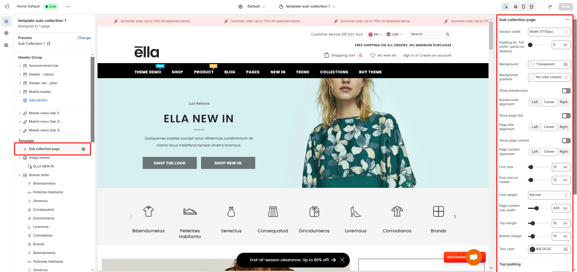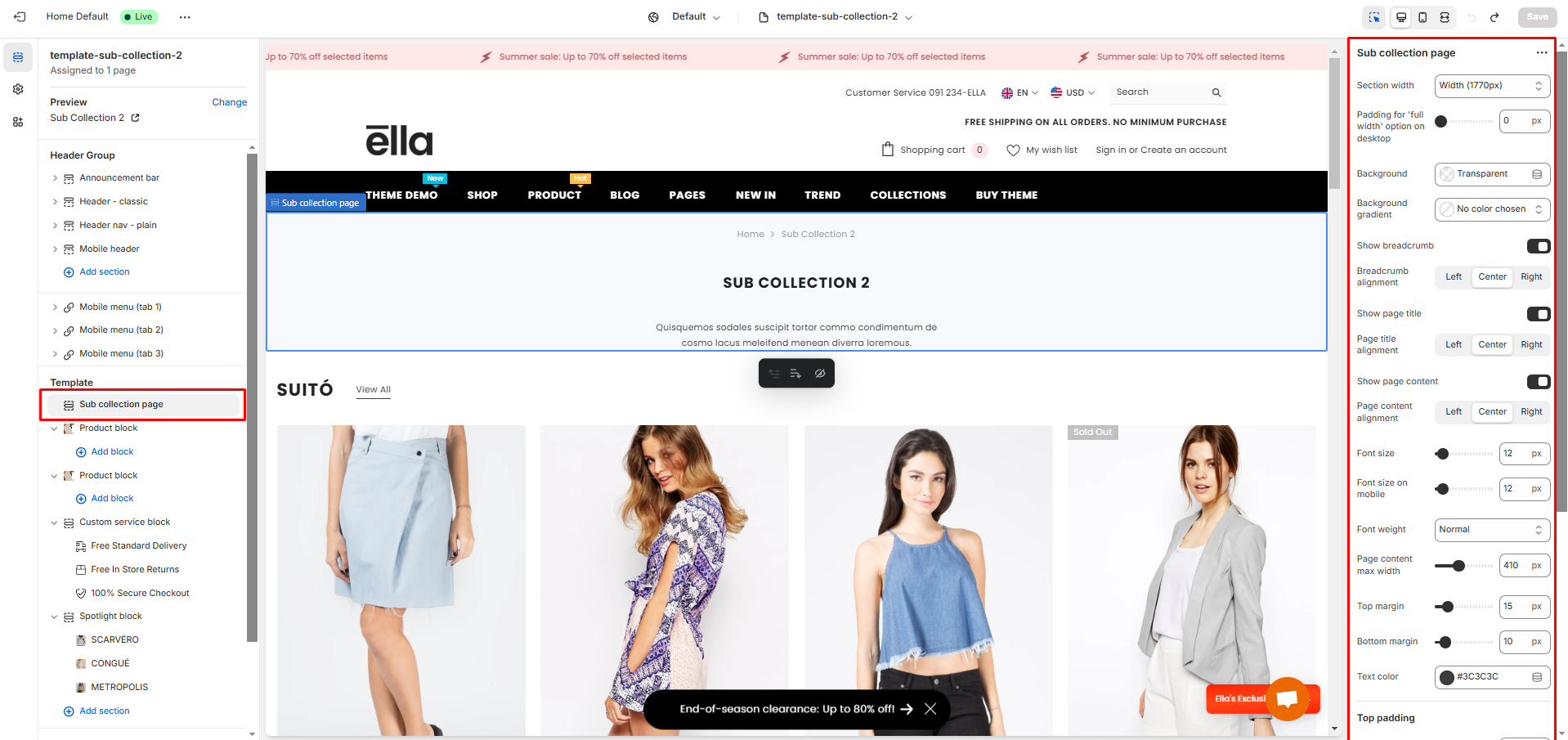


| Settings | Meaning |
|---|---|
| Section width | Select the layout width of the whole section. The options are: Default (same as the body width) Width (1170px) Width (1770px) Full width (100% of the viewport width). |
| Padding for 'full width' option on desktop | Determines the left and right padding of the full width layout. |
| Background - Background gradient | Set the background color/gradient for the section. |
| Show breadcrumb | Enable to show the breadcrumb. |
| Breadcrumb alignment | Select the position of the breadcrumb to be either to the left, right, or center of its container. |
| Show page title | Enable to show the page title. |
| Page title alignment | Select the position of the page title to be either to the left, right, or center of its container. |
| Show page content | Enable to show the page content. |
| Page content alignment | Select the position of the page content to be either to the left, right, or center of its container. |
| Font size | Determines the font size for the page content on the desktop. |
| Font size on mobile | Determines the font size for the page content on the mobile. |
| Font weight | Select the font weight for the page content. |
| Page content max width | Determines the max width for the page content. |
| Top margin | Determines the top spacing of the page content. |
| Bottom margin | Determines the bottom spacing of the page content. |
| Text color | Set the color for the page content. |
| Settings | Meaning |
|---|---|
| Desktop | Determines the height of the top inner space of the section on the desktop device. Can be from 0px to 100px, increasing arithmetically of 5px (pixel). |
| Tablet | Determines the height of the top inner space of the section on the tablet device. Can be from 0px to 100px, increasing arithmetically of 5px (pixel). |
| Mobile | Determines the height of the top inner space of the section on the mobile device. Can be from 0px to 100px, increasing arithmetically of 5px (pixel). |
| Settings | Meaning |
|---|---|
| Desktop | Determines the height of the bottom inner space of the section on the desktop device. Can be from 0px to 100px, increasing arithmetically of 5px (pixel). |
| Tablet | Determines the height of the bottom inner space of the section on the tablet device. Can be from 0px to 100px, increasing arithmetically of 5px (pixel). |
| Mobile | Determines the height of the bottom inner space of the section on the mobile device. Can be from 0px to 100px, increasing arithmetically of 5px (pixel). |