

| Setting | Description |
|---|---|
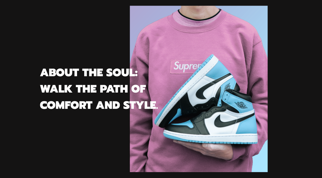
| First image | The first image for the section. If two images are added to the section, this image will appear to the left on desktop or at the top on mobile devices. |
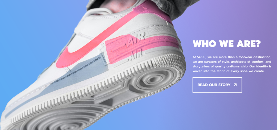
| Second image | The second image for the section. If two images are added to the section, this image will appear to the right on desktop or at the bottom on mobile devices. |
| Image overlay opacity | Dims the banner images with an overlay. |
| Banner height | Determines the height of the image:
|
| Desktop content position | Positions the content relative to the image banner:
|
| Show container on desktop | Show background for the content. |
| Desktop content alignment | Sets the alignment of the content on desktop:
|
| Desktop content width | Determines the width of the content on desktop:
|
| Color scheme | Set the color for the section. |
| Setting | Description |
|---|---|
| Image behavior | Animation for the image when scroll:
|
| Setting | Description |
|---|---|
| Mobile content alignment | Sets the alignment of the content on mobile:
|
| Stack images on mobile | Displays images in a vertical column on mobile. |
| Show content below images on mobile | The content displays below the images, instead of lying on the images. |
| Setting | Description |
|---|---|
| Desktop left padding | Determines the width of the left inner space of the section on desktop. Can be from 0px to 100px, increasing arithmetically of 2px (pixel). |
| Desktop right padding | Determines the width of the right inner space of the section on desktop. Can be from 0px to 100px, increasing arithmetically of 2px (pixel). |
| Top padding | Determines the height of the top inner space of the section. Can be from 0px to 150px, increasing arithmetically of 2px (pixel). |
| Bottom padding | Determines the height of the bottom inner space of the section. Can be from 0px to 150px, increasing arithmetically of 2px (pixel). |
| Setting | Description |
|---|---|
| Heading | The heading for this block. |
| Heading size | The size of the heading text:
|
| Setting | Description |
|---|---|
| Description | The text for this block. |
| Text size | The size of the text:
|
| Setting | Description |
|---|---|
| First button label | The text that displays on the first button. |
| First button link | The URL that you want the first button to link to. |
| First button style | Style of the first button:
|
| Second button label | The text that displays on the second button. |
| Second button link | The URL that you want the second button to link to. |
| Second button style | Style of the second button:
|