Soul Documentation
  • Greeting
  • UPDATES
    • What's new in Soul
      • Release Notes
      • Version 3.1.0 release
      • Version 3.0.0 release
    • Demo stores
      • Elegant
      • Warm
      • Dark
  • SECTIONS
    • Header
      • Announcement bar
      • Header
    • Template sections
      • A to Z brands
      • Blog posts
      • Collage
      • Collapsible content
      • Collection list
      • Collection showcase
      • Collection spotlight grid
      • Contact form
      • Custom Liquid
      • Dynamic hover blocks
      • Email signup
      • Featured collection
      • Featured product
      • Flexible content
      • Image banner
      • Image comparison
      • Image gallery
      • Image with text
      • Image with product
      • Lookbook
      • Map
      • Multicolumn
      • Multirow
      • Rich text
      • Page
      • Recently viewed products
      • Running text with image
      • Shop the look
      • Slideshow
      • Testimonials
      • Video
    • Footer
    • Popup
  • THEME SETTINGS
    • Logo
    • Colors
    • Typography
    • Layout
    • Animations
    • Buttons
    • Variant pills
    • Inputs
    • Product cards
    • Collection cards
    • Blog cards
    • Pop-ups
    • Badges
    • Social media
    • Search behavior
    • Currency format
    • Cart
    • Breadcrumb
    • Preloading screen
    • Back to top
    • Custom CSS
  • COLLECTION LIST PAGE
    • Collections list page
  • COLLECTION PAGE
    • Collection
      • Collection banner
      • Product grid
  • PRODUCT PAGE
    • Product page
      • Product information
      • Product tabs
      • Related products
  • BLOG & BLOG POST PAGE
    • Blog page
    • Blog post page
  • CART
    • Cart
  • OTHER PAGES
    • How to create a page?
    • Search page
    • Password page
    • 404 page
  • TUTORIALS & TOPICS
    • How to enable size chart on product page
    • How to enable gift wrap option on cart page
    • How to enable free shipping notification
    • How to add a countdown timer on the product page
  • Knowledge base
    • Getting started in Shopify
    • Shopify help center
    • Shopify developers platform
  • Get Support
Powered by GitBook
On this page
  • Section settings
  • Small collection block
  • Large collection block
  1. SECTIONS
  2. Template sections

Collage

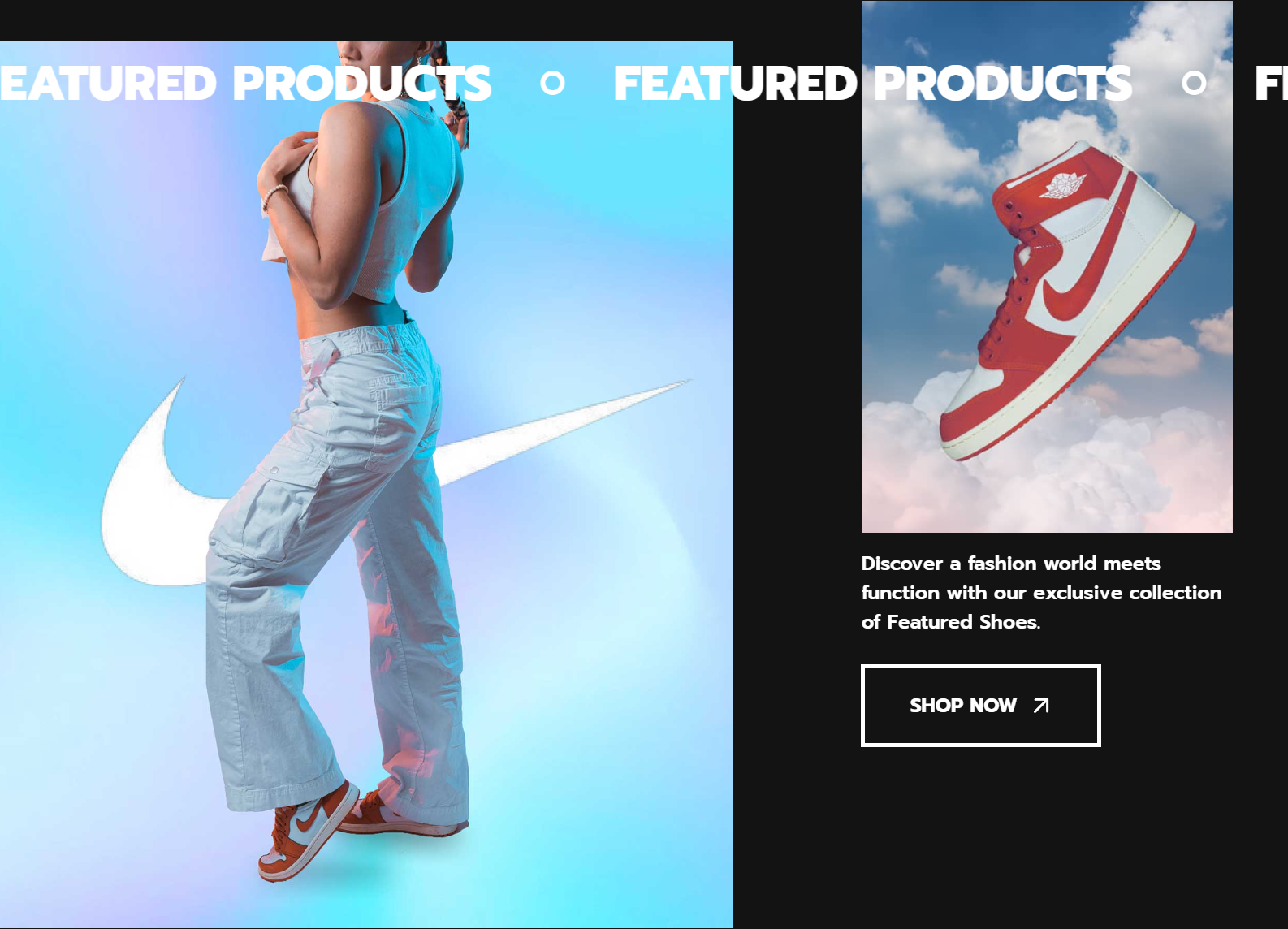
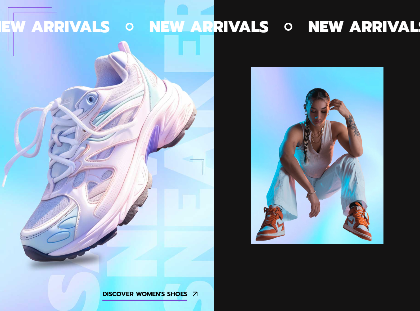
You can create a collage of image and collection. Each Collage section contains only one block, either a Large collection or a Small collection.

PreviousBlog postsNextCollapsible content

Last updated 9 months ago

To add this section, please follow the below steps:

  1. From your Shopify admin, go to Online Store -> Themes.

  2. Find the theme that you want to edit, and then click Customize.

  3. Click Add section and choose "Collage".

Section settings

Setting
Description

Heading

The title for this section.

Heading style

Style of the heading:

  • Default

  • Marquee from left to right - Scrolls text horizontally on the screen, starting from the left side and moving towards the right.

  • Marquee from right to left - Scrolls text horizontally on the screen, starting from the right side and moving towards the left.

Heading size

The size of the heading text:

  • Small

  • Medium

  • Large

  • Extra large

Heading alignment

The alignment of the heading text and description within the section container:

  • Left - Aligns the heading and description to the left.

  • Center (default) - Aligns the heading and description in the center.

  • Right - Aligns the heading and description to the right.

Description

The description for this section.

Desktop layout

How the blocks display on desktop.

  • Left large block - The first block in the section displays on the left and larger than rest block.

  • Right large block - The last block in the section displays on the right and larger than rest block.

Desktop small block position

Sets the vertical position of the content on desktop:

  • Top - Displays the content at the top.

  • Middle - Displays the content in the middle.

  • Bottom - Displays the text at the bottom.

Color scheme

Set the color of the section.

Image banner

Setting
Description

Image

The image for this section.

Link

The URL that you want the image to link to.

Section padding

Setting
Description

Top padding

Determines the height of the top inner space of the section. Can be from 0px to 150px, increasing arithmetically of 2px (pixel).

Bottom padding

Determines the height of the bottom inner space of the section. Can be from 0px to 150px, increasing arithmetically of 2px (pixel).

Left padding

Determines the width of the left inner space of the section. Can be from 0px to 150px, increasing arithmetically of 2px (pixel).

Right padding

Determines the width of the right inner space of the section. Can be from 0px to 150px, increasing arithmetically of 2px (pixel).

Small collection block

Setting
Description

Collection

Select a collection that you want show in this block.

Show heading

Show the collection title.

Button label

The text that displays on the button.

Leave the label blank to hide the button.

Button style

Style of the button:

  • Filled

  • Text link

  • Outlined

Large collection block

Setting
Description

Collection

Select a collection that you want show in this block.

Show heading

Show the collection title.

Collage with large collection
Collage with small collection