> For the complete documentation index, see [llms.txt](https://halosoft.gitbook.io/soul-documentation/llms.txt). Markdown versions of documentation pages are available by appending `.md` to page URLs; this page is available as [Markdown](https://halosoft.gitbook.io/soul-documentation/sections/popup/age-verification-popup.md).

# Age verification popup

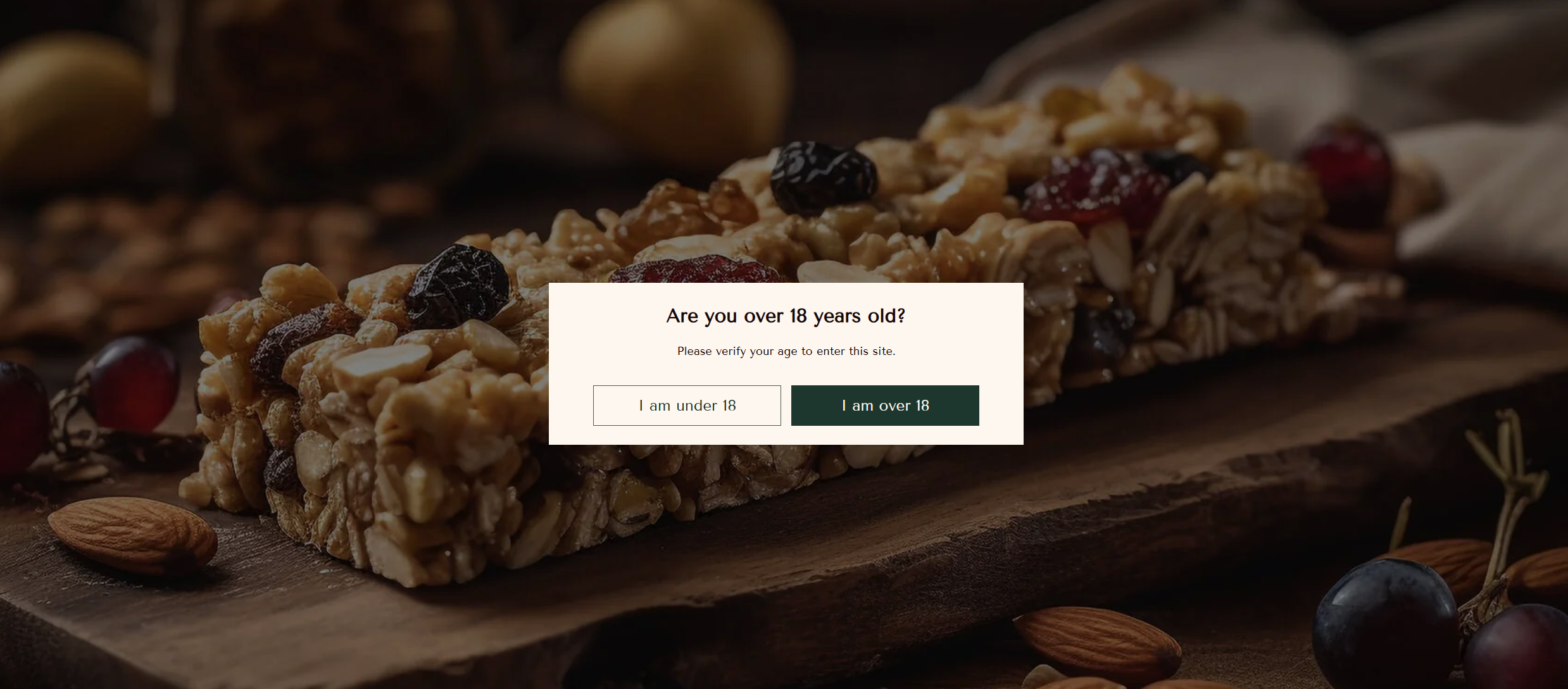
An age verification popup helps you restrict access to your store for underage visitors and ensure compliance with age-related regulations. It’s especially useful for stores selling alcohol, tobacco, or other age-restricted products.

<figure><img src="/files/Oj27DvT21mTfvUVrWSm6" alt=""><figcaption></figcaption></figure>

To add this section, please follow the below steps:

1. From your **Shopify admin**, go to **Online Store → Themes**.
2. Find the theme that you want to edit, and then click **Customize**.
3. Scroll down to the **Popup group** at the bottom.
4. Click **Add section**, and choose **“Age verification popup”**.

## Section settings <a href="#section-settings-1" id="section-settings-1"></a>

<table><thead><tr><th width="238">Setting</th><th>Description</th></tr></thead><tbody><tr><td>Show again after</td><td>Determines the time the popup displays again after closing the popup.</td></tr><tr><td>Color scheme</td><td>Set the color for the popup.</td></tr></tbody></table>

### Appearance

<table><thead><tr><th width="238">Setting</th><th>Description</th></tr></thead><tbody><tr><td>Color scheme</td><td>Set the color for the background.</td></tr><tr><td>Background media</td><td><p>Choose the style of background you’d like to use:</p><ul><li>None</li><li>Image</li></ul></td></tr><tr><td>Background overlay</td><td>Enable background overlay</td></tr></tbody></table>

### Spacing

<table><thead><tr><th width="238">Setting</th><th>Description</th></tr></thead><tbody><tr><td>Desktop left padding</td><td>Determines the width of the left inner space of the section on desktop. Can be from 0px to 100px, increasing arithmetically of 2px (pixel).</td></tr><tr><td>Desktop right padding</td><td>Determines the width of the right inner space of the section on desktop. Can be from 0px to 100px, increasing arithmetically of 2px (pixel).</td></tr><tr><td>Top padding</td><td>Determines the height of the top inner space of the section. Can be from 0px to 150px, increasing arithmetically of 2px (pixel).</td></tr><tr><td>Bottom padding</td><td>Determines the height of the bottom inner space of the section. Can be from 0px to 150px, increasing arithmetically of 2px (pixel).</td></tr></tbody></table>

## Text block

<table><thead><tr><th width="239">Setting</th><th>Description</th></tr></thead><tbody><tr><td>Description</td><td>The text display in the block.</td></tr><tr><td>Text size</td><td><p>The size of the text:</p><ul><li>Small</li><li>Medium</li><li>Large</li><li>Extra large</li></ul></td></tr></tbody></table>

## Heading block

<table><thead><tr><th width="239">Setting</th><th>Description</th></tr></thead><tbody><tr><td>Heading</td><td>The title for the block.</td></tr><tr><td>Heading size</td><td><p>The size of the heading text:</p><ul><li>Small</li><li>Medium</li><li>Large</li><li>Extra large</li></ul></td></tr></tbody></table>

## Button block

<table><thead><tr><th width="238">Setting</th><th>Description</th></tr></thead><tbody><tr><td>First button label</td><td>The text for the first button.</td></tr><tr><td>First button link</td><td>The link that you want customers to navigate to if they click the first button.</td></tr><tr><td>First button style</td><td>Style of the first button.</td></tr><tr><td>Second button label</td><td>The text for the second button.</td></tr><tr><td>Second button style</td><td>Style of the second button.</td></tr></tbody></table>

## Image block

<table><thead><tr><th width="239">Setting</th><th>Description</th></tr></thead><tbody><tr><td>Image</td><td>Add a image for this block.</td></tr><tr><td>Image width</td><td>Determines the width of the image.</td></tr></tbody></table>
