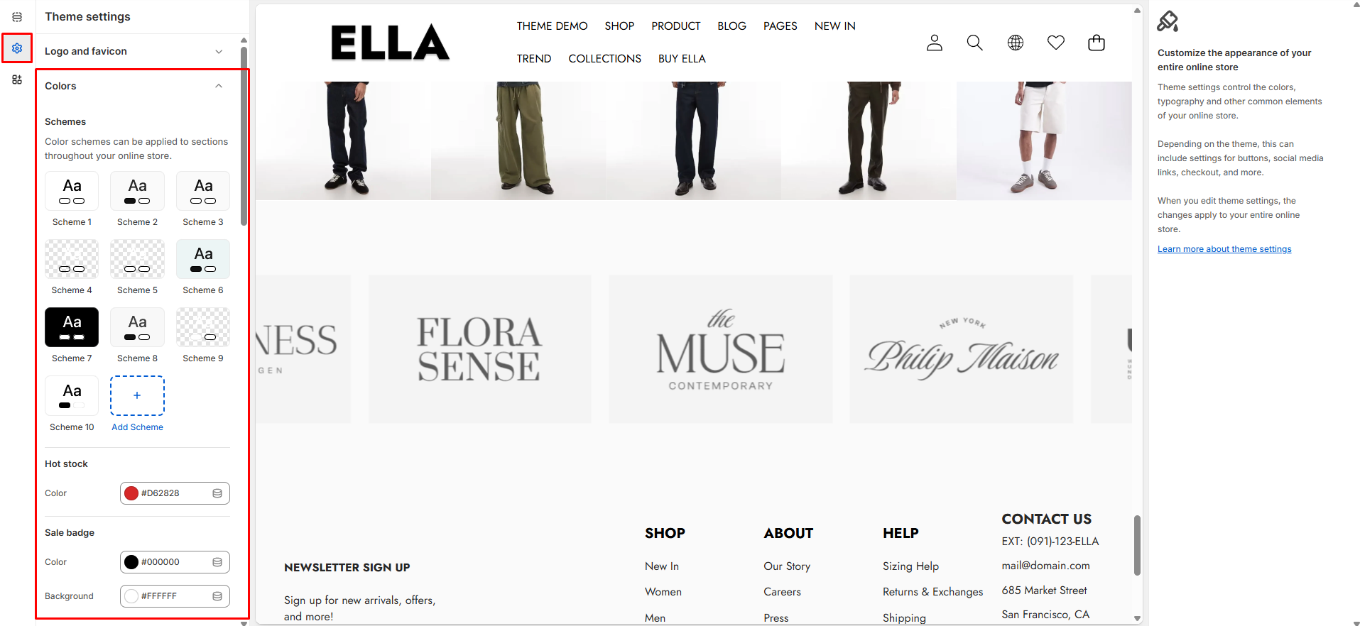
# Colors
Define global color schemes and tokens used across the theme (backgrounds, text, buttons, badges, etc.). Changing these values updates the visual identity and ensures consistent colors throughout the storefront.
1. From your Shopify admin, go to **Online Store ->** **Themes**.
2. Find the theme that you want to edit, and then click **Customize**.
3. Click **Theme settings ->** **Colors.**
### Colors Settings
| Settings | Type | Default | Description |
| ------------------------------------------ | -------------------- | ------- | ------------------------------------------------------------------------ |
| Color Schemes | color\_scheme\_group | | Container for named color schemes used by the theme (definitions below). |
| Background | color | #FFFFFF | Background color used site-wide (pages and panels). |
| Background Gradient | color\_background | | Optional gradient overlay for backgrounds where supported. |
| Foreground Heading | color | #000000 | Color used for headings and prominent text. |
| Foreground | color | #000000 | Default body text color across the site. |
| Primary | color | #000F9F | Primary brand color used for accents and CTAs. |
| Primary Hover | color | #000000 | Hover state color for primary elements. |
| Border | color | #E6E6E6 | Default border color for cards, inputs, and separators. |
| Shadow | color | #000000 | Shadow color used for elevation effects. |
| Primary Button Background | color | #000000 | Background color for primary buttons. |
| Primary Button Background Gradient | color\_background | | Optional gradient for primary button backgrounds. |
| Primary Button Text | color | #FFFFFF | Text color for primary buttons. |
| Primary Button Border | color | #000000 | Border color for primary buttons. |
| Primary Button Hover Background | color | #000000 | Background color when primary button is hovered. |
| Primary Button Hover Background Gradient | color\_background | | Optional hover gradient for primary buttons. |
| Primary Button Hover Text | color | #FFFFFF | Text color for hovered primary buttons. |
| Primary Button Hover Border | color | #000000 | Border color for hovered primary buttons. |
| Secondary Button Background | color | #FFFFFF | Background color for secondary buttons. |
| Secondary Button Background Gradient | color\_background | | Optional gradient for secondary button backgrounds. |
| Secondary Button Text | color | #000000 | Text color for secondary buttons. |
| Secondary Button Border | color | #000000 | Border color for secondary buttons. |
| Secondary Button Hover Background | color | #FFFFFF | Hover background for secondary buttons. |
| Secondary Button Hover Background Gradient | color\_background | | Optional hover gradient for secondary buttons. |
| Secondary Button Hover Text | color | #000000 | Hover text color for secondary buttons. |
| Secondary Button Hover Border | color | #000000 | Hover border color for secondary buttons. |
| Input Background | color | #FFFFFF | Background color for form inputs and search fields. |
| Input Text Color | color | #000000 | Text color inside inputs. |
| Input Border Color | color | #000000 | Border color for input elements. |
| Input Hover Background | color | #F5F5F5 | Background color for inputs on hover/focus. |
| Arrow Color | color | #333333 | Foreground color used for arrow icons. |
| Arrow Background | color | #ffffff | Background color used behind arrow buttons. |
| Arrow Border | color | #333333 | Border color for arrow controls. |
| Arrow Color Hover | color | #333333 | Arrow color on hover. |
| Arrow Background Hover | color | #ffffff | Arrow background on hover. |
| Pagination Color | color | #cecece | Color for pagination bullets/controls. |
| Pagination Active Color | color | #333333 | Active pagination indicator color. |
| Hot Stock Color | color | #d62828 | Color used for hot-stock highlight/label. |
| Sale Badge Color | color | #000000 | Text color for sale badges. |
| Sale Badge Background | color | #ffffff | Background color for sale badges. |
| Sold Out Badge Color | color | #000000 | Text color for sold out badges. |
| Sold Out Badge Background | color | #ffffff | Background color for sold out badges. |
| New Badge Color | color | #000000 | Text color for new-product badges. |
| New Badge Background | color | #ffffff | Background color for new-product badges. |
| Custom Badge Color | color | #000000 | Text color for custom badges. |
| Custom Badge Background | color | #ffffff | Background color for custom badges. |
| Wishlist Icon | color | #000000 | Icon color for wishlist hearts. |
| Wishlist Background | color | #ffffff | Background for wishlist icon/button. |
| Quick View Icon | color | #000000 | Icon color used for quick view action. |
| Quick View Background | color | #ffffff | Quick view button background color. |
| Compare Icon | color | #000000 | Icon color for compare action. |
| Compare Background | color | #ffffff | Background color for compare button/icon. |
### Need More Help?
If you experience any difficulties or require extra support with your Ella theme, feel free to contact our support team through our [Ticket System](https://halosoft.ticksy.com/) — we’ll get back to you within 24 hours.
Simply scan the QR code below to join our Facebook community and stay updated with the latest news, tips, and announcements.