Testimonial Block - Settings Guide
### Layout Settings
| Setting | Type | Default | Description | Visibility |
| ----------------------- | -------- | ------- | -------------------------------------------------------------------------------------------------------------------------------------------------------------------------------------------------------------------------------------------------------- | ------------------------ |
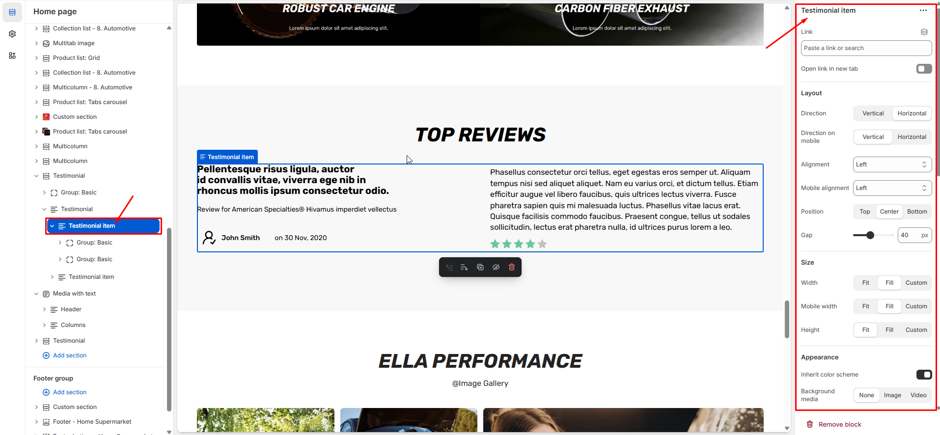
| **Direction** | Select | Column | Content flow direction:
• Vertical - Stack items vertically
• Horizontal - Arrange items horizontally
| - |
| **Direction on Mobile** | Select | Column | Mobile layout direction:
• Vertical - Stack items vertically
• Horizontal - Arrange items horizontally
| - |
| **Alignment** | Select | Left | Horizontal alignment when direction is Row:
• Left - Align to left
• Center - Center alignment
• Right - Align to right
• Space Between - Distribute space
| When Direction is Row |
| **Mobile Alignment** | Select | Left | Mobile horizontal alignment when direction is Row:
• Left - Align to left
• Center - Center alignment
• Right - Align to right
• Space Between - Distribute space
| When Direction is Row |
| **Position** | Select | Center | Vertical alignment when direction is Row:
• Top - Align to top
• Center - Center alignment
• Bottom - Align to bottom
| When Direction is Row |
| **Align Baseline** | Checkbox | No | Align text to baseline | When Position is Bottom |
| **Alignment (Column)** | Select | Left | Horizontal alignment when direction is Column:
• Left - Align to left
• Center - Center alignment
• Right - Align to right
| When Direction is Column |
| **Position (Column)** | Select | Center | Vertical alignment when direction is Column:
• Top - Align to top
• Center - Center alignment
• Bottom - Align to bottom
• Space Between - Distribute space
| When Direction is Column |
| **Gap** | Range | 12px | Spacing between child elements (0-100px) | - |
***
### Display Type Settings
| Setting | Type | Default | Description |
| -------- | ------ | -------- | ----------------------------------------------------------------------------------------------------------------------------------------------------- |
| **Type** | Select | Carousel | Display mode:
• Carousel - Sliding carousel with navigation
• Marquee - Continuous scrolling animation
|
***
### Carousel Settings
*Only visible when Type is **Carousel***
| Setting | Type | Default | Description | Visibility |
| ------------------- | -------- | ------- | ------------------------------------------------------------------------------------------------------------------------------------------------------------------------------------------------------------------------- | ----------------------------------- |
| **Columns** | Range | 3 | Number of testimonials per view (1-4, with 0.1 steps) | Carousel only |
| **Mobile Columns** | Select | 1 | Number of columns on mobile (1, 1.3, or 2) | Carousel only |
| **Loop** | Checkbox | No | Enable infinite loop scrolling | Carousel only |
| **Centered Slides** | Checkbox | No | Center active slide in view | Carousel only |
| **Navigation** | Select | Arrows | Navigation style:
• None - No navigation
• Arrows - Previous/Next arrows
• Pagination - Dots/Progress
• Arrows + Pagination - Both
| Carousel only |
| **Arrows Position** | Select | Inside | Arrow placement:
• Inside Slide - Over content
• Bottom Slide - Below content
| When navigation includes arrows |
| **Pagination Type** | Select | Bullets | Pagination style:
• Dots - Bullet dots
• Dynamic - Dynamic dots
• Progress - Progress bar
• Counter - Numeric counter
| When navigation includes pagination |
***
### Marquee Settings
*Only visible when Type is **Marquee***
| Setting | Type | Default | Description | Visibility |
| -------------------- | ------ | ------- | ------------------------------------------------------------------------------------------------------------------------------ | ------------ |
| **Motion Direction** | Select | Reverse | Scrolling direction:
• Forward - Left to right
• Reverse - Right to left
| Marquee only |
| **Animation Type** | Select | Auto | Animation trigger:
• Auto - Continuous animation
• Scroll - Triggered by scroll
| Marquee only |
| **Speed** | Range | 20 | Animation speed (5-50) | Marquee only |
***
### Size Settings
| Setting | Type | Default | Description | Visibility |
| ----------------------- | ------ | ------- | ------------------------------------------------------------------------------------------------------------------------------------------------------------------------------------------------------ | --------------------------- |
| **Width** | Select | Fill | Block width behavior:
• Fit Content - Width based on content
• Fill - Take full available width
• Custom - Custom width percentage
| - |
| **Custom Width** | Range | 100% | Custom width percentage (0-100%) | When Width is Custom |
| **Width Mobile** | Select | Fill | Mobile width behavior:
• Fit Content - Width based on content
• Fill - Take full available width
• Custom - Custom width percentage
| - |
| **Custom Width Mobile** | Range | 100% | Custom mobile width percentage (0-100%) | When Mobile Width is Custom |
***
### Appearance Settings
| Setting | Type | Default | Description | Visibility |
| ------------------------ | ---------------- | ------- | -------------------------------------------- | -------------------------------- |
| **Inherit Color Scheme** | Checkbox | Yes | Use parent section's color scheme | - |
| **Background** | Color | #FFFFFF | Background color with alpha support | When not inheriting color scheme |
| **Background Gradient** | Color Background | - | Background gradient overlay | When not inheriting color scheme |
| **Headings** | Color | #000000 | Heading text color with alpha support | When not inheriting color scheme |
| **Text** | Color | #000000 | Body text color with alpha support | When not inheriting color scheme |
| **Primary Color** | Color | #000F9F | Primary/accent color with alpha support | When not inheriting color scheme |
| **Primary Hover Color** | Color | #000000 | Primary hover state color with alpha support | When not inheriting color scheme |
| **Borders** | Color | #E6E6E6 | Border color with alpha support | When not inheriting color scheme |
| **Shadow Color** | Color | #000000 | Shadow color with alpha support | When not inheriting color scheme |
***
### Background Media Settings
| Setting | Type | Default | Description | Visibility |
| -------------------- | ------------ | ------- | ------------------------------------------------------------------------------------------------------------------------------------------------------------------------------------------------------ | ------------------------------------- |
| **Background Media** | Select | None | Background media type:
• None - No background
• Image - Background image
• Video - Background video
| - |
| **Background Image** | Image Picker | - | Upload background image | When media is Image |
| **Background Video** | Video URL | - | External video URL (YouTube/Vimeo) | When media is Video |
| **Content Overlay** | Checkbox | No | Show content over background media | When background media is set |
| **Image Ratio** | Select | Adapt | Media aspect ratio:
• Adapt - Natural ratio
• Square - 1:1 ratio
• Portrait - 3:4 ratio
• Landscape - 4:3 ratio
| When media is set and overlay enabled |
***
### Border Settings
| Setting | Type | Default | Description | Visibility |
| ----------------- | ------ | ------- | ------------------------------------------------------------------------------------------------------- | ------------------------------ |
| **Borders Style** | Select | None | Border style:
• None - No borders
• Solid - Solid border
| - |
| **Border Width** | Range | 1px | Border thickness (0-10px) | When Borders Style is not None |
| **Border Radius** | Range | 0px | Corner roundness (0-100px) | - |
***
### Overlay Settings
| Setting | Type | Default | Description | Visibility |
| ---------------------- | -------- | --------- | ------------------------------------------------------------------------------------------------------------------------ | ------------------------ |
| **Background Overlay** | Checkbox | No | Enable background overlay | - |
| **Overlay Color** | Color | #00000026 | Overlay color with alpha support | When overlay is enabled |
| **Overlay Style** | Select | Solid | Overlay type:
• Solid - Solid color overlay
• Gradient - Gradient overlay
| When overlay is enabled |
| **Gradient Direction** | Select | To Top | Gradient direction:
• Up - Bottom to top
• Down - Top to bottom
| When overlay is gradient |
***
### Shadow Settings
| Setting | Type | Default | Description |
| --------------------- | ----- | --------- | ---------------------------------------- |
| **Shadow Color** | Color | #00000000 | Shadow color with alpha support |
| **Horizontal Offset** | Range | 0px | Horizontal shadow position (-12 to 12px) |
| **Vertical Offset** | Range | 0px | Vertical shadow position (-12 to 12px) |
| **Blur** | Range | 0px | Shadow blur amount (0-20px) |
| **Spread** | Range | 0px | Shadow spread radius (0-100px) |
***
### Margin Settings
| Setting | Type | Default | Description |
| ------------------------ | ----- | ------- | --------------------------------- |
| **Margin Top** | Range | 0px | Top margin spacing (0-100px) |
| **Margin Top Mobile** | Range | 0px | Top margin on mobile (0-100px) |
| **Margin Bottom** | Range | 0px | Bottom margin spacing (0-100px) |
| **Margin Bottom Mobile** | Range | 0px | Bottom margin on mobile (0-100px) |
| **Margin Left** | Range | 0px | Left margin spacing (0-100px) |
| **Margin Left Mobile** | Range | 0px | Left margin on mobile (0-100px) |
| **Margin Right** | Range | 0px | Right margin spacing (0-100px) |
| **Margin Right Mobile** | Range | 0px | Right margin on mobile (0-100px) |
***
### Padding Settings
| Setting | Type | Default | Description |
| ------------------ | ----- | ------- | -------------------------------- |
| **Padding Top** | Range | 0px | Top padding spacing (0-100px) |
| **Padding Bottom** | Range | 0px | Bottom padding spacing (0-100px) |
| **Padding Left** | Range | 0px | Left padding spacing (0-100px) |
| **Padding Right** | Range | 0px | Right padding spacing (0-100px) |
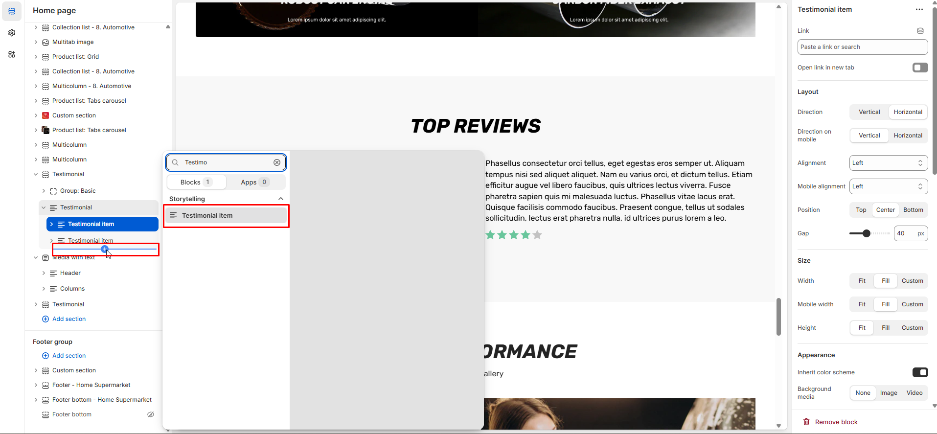
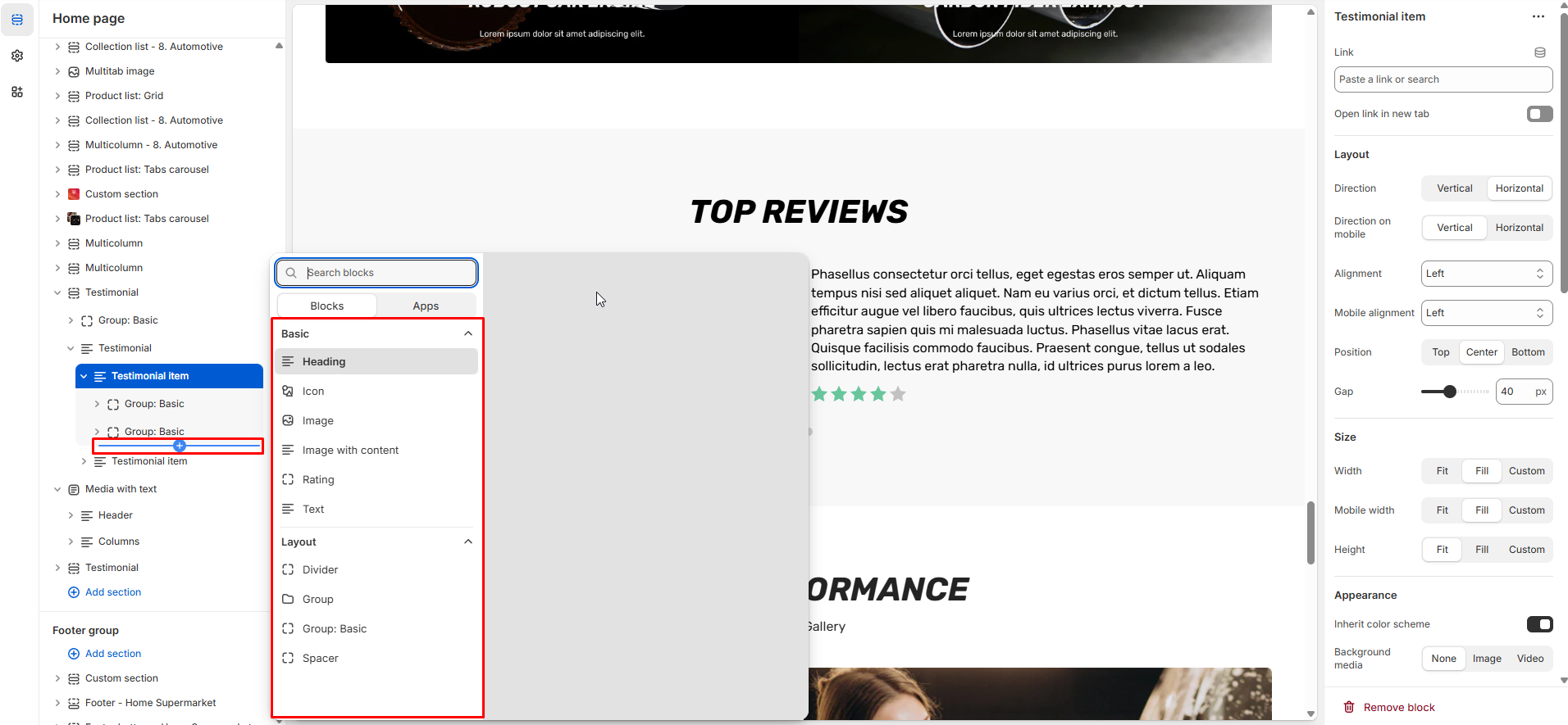
## Testimonial Item Block
The "**Testimonial item**" block can be combined with other blocks to create a layout such as Heading, Text, Button, Image, Group, etc.
* Child Blocks Supported
* `image` - Image blocks
* `icon` - Icon blocks
* `text` - Text content blocks
* `rating` - Rating/star blocks
* `image-with-content` - Combined image and content blocks
* `@app` - App blocks
* `group` - Nested group blocks
* `group-basic` - Basic group blocks
* `spacer` - Spacing blocks
* `_divider` - Custom divider blocks