> For the complete documentation index, see [llms.txt](https://halosoft.gitbook.io/ella-7-documentation/llms.txt). Markdown versions of documentation pages are available by appending `.md` to page URLs; this page is available as [Markdown](https://halosoft.gitbook.io/ella-7-documentation/product-page/back-in-stock-alert.md).
# Back in stock alert
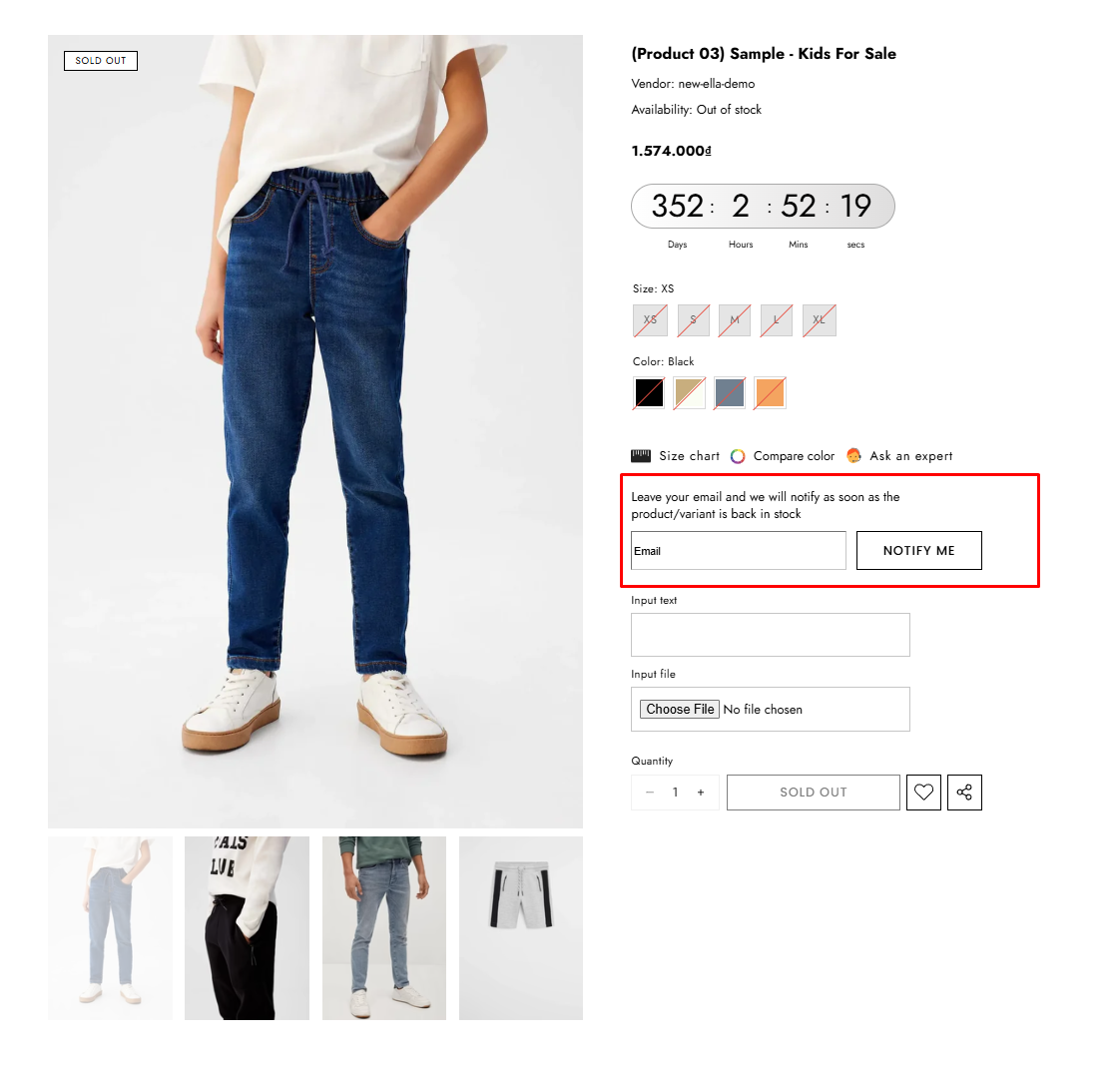
Notifies customers when an out-of-stock product becomes available again, helping recover missed sales and re-engage interested shoppers.
### **How to add the** Back in stock alert **block?**
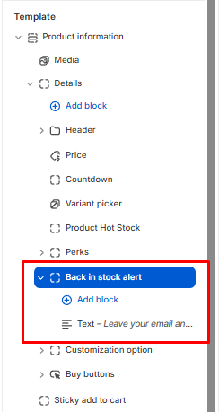
1. From your Shopify admin, go to **Online Store** -> **Themes**.
2. Find the theme that you want to edit, and then click **Customize**.
3. Choose **Products** from the dropdown window.
4. In the **Templates -> Add Product information ->** **Add section Details ->** choose **Back in stock alert**
*\*This block is displayed **only when the product is out of stock**.*
## Back In Stock Alert Settings
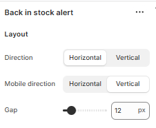
### Layout
| Label | Type | Description | Visibility |
| ------------------- | -------- | ----------------------------------------------------------------------------------------------------- | -------------- |
| Direction | `select` | Choose the layout orientation of the alert on desktop: **Horizontal** (row) or **Vertical** (column). | Always visible |
| Direction on mobile | `select` | Choose the layout orientation of the alert on mobile devices. | Always visible |
| Gap | `range` | Adjust the spacing (in pixels) between the different elements within the alert block. | Always visible |
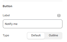
### Button
| Label | Type | Description | Visibility |
| ----- | -------- | ----------------------------------------------------------------------------------------------------------------------------------------- | -------------- |
| Label | `text` | Enter the text to be displayed on the submission button (e.g., "Notify me"). | Always visible |
| Type | `select` | Choose the button's visual style. **Default** uses the theme's standard button style, while **Outline** uses a border with no background. | Always visible |
### Message
| Label | Type | Description | Visibility |
| -------------------- | ------ | ---------------------------------------------------------------------------------------------------------------------------------------------------- | -------------- |
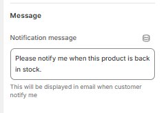
| Notification message | `text` | Customize the default message that is included when a customer signs up for an alert. This message will be displayed in the email sent to the store. | Always visible |